Logo Applications
Maternity Wear
Baby Boutique
Newborn Photography
Parenting Classes
Lactation Consultancy
Midwifery Service
Baby Shower Planning
Postnatal Care
Infant Nutrition
Childbirth Education

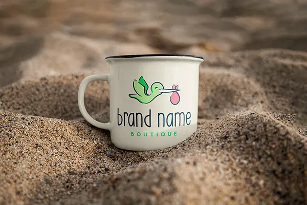
The logo presents a charming depiction of a stork in mid-flight, carrying a symbolic pink bag, possibly representing the delivery of a newborn baby. The stork is portrayed in a vibrant green hue, which may signify growth, renewal, and a natural connection, resonating well with themes of new life and beginnings. The bird’s silhouette is sleek and smooth, with a stylized design that lends a modern and friendly feel to the image.
Beneath the illustration, the font is set in a playful, lowercase sans-serif typeface, which enhances the logo’s welcoming and accessible character.
This logo appeals to a demographic looking for baby-related products, services, or a boutique experience, with its design ensuring easy recognition and memorability.
| License |
Worldwide, Royalty-Free, Non-exclusive |
|---|
| License |
Worldwide, Royalty-Free, Non-exclusive |
|---|
Maternity Wear
Baby Boutique
Newborn Photography
Parenting Classes
Lactation Consultancy
Midwifery Service
Baby Shower Planning
Postnatal Care
Infant Nutrition
Childbirth Education

| License |
Worldwide, Royalty-Free, Non-exclusive |
|---|
| License |
Worldwide, Royalty-Free, Non-exclusive |
|---|
No account yet?
Create an Account
Reviews
Clear filtersThere are no reviews yet.